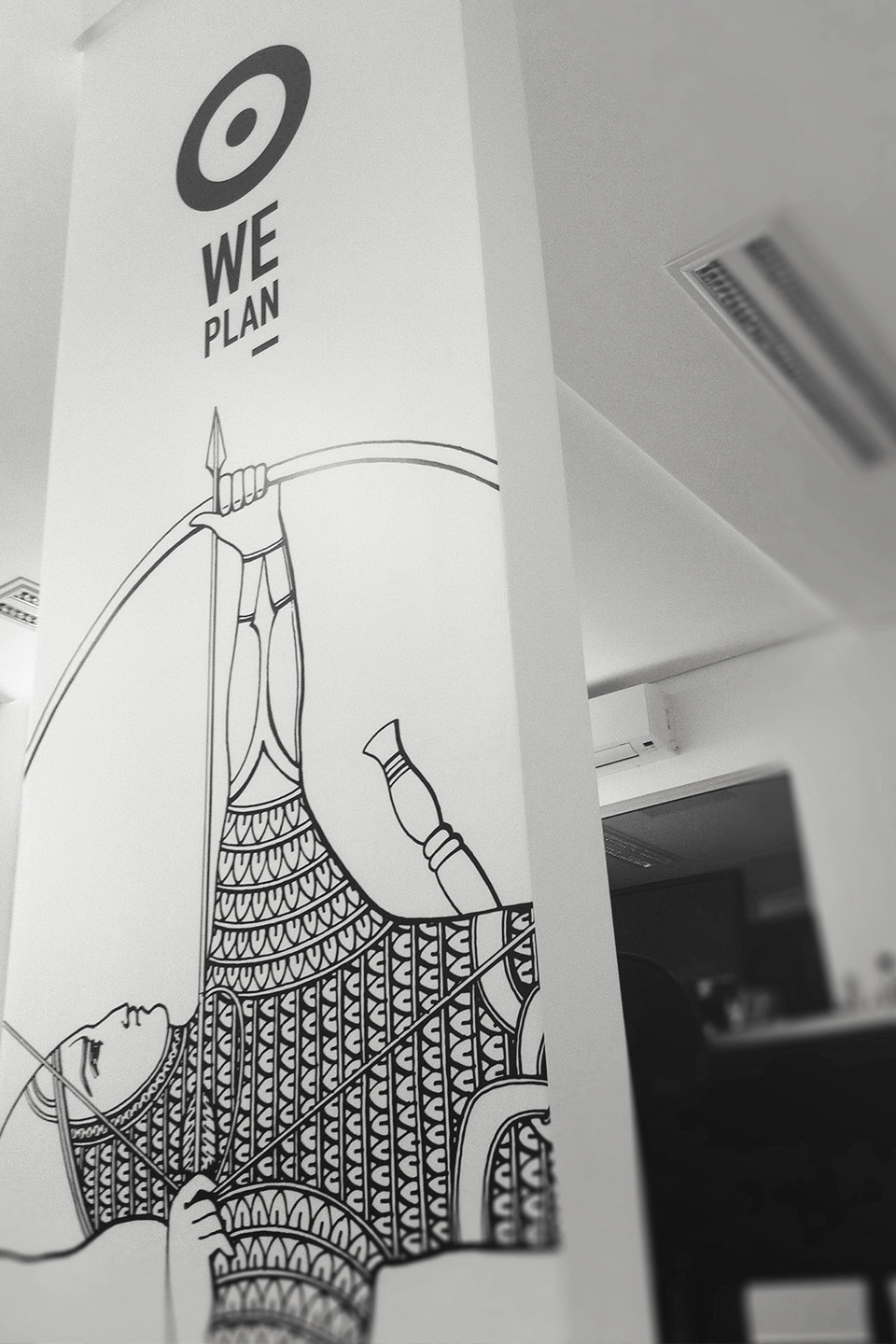
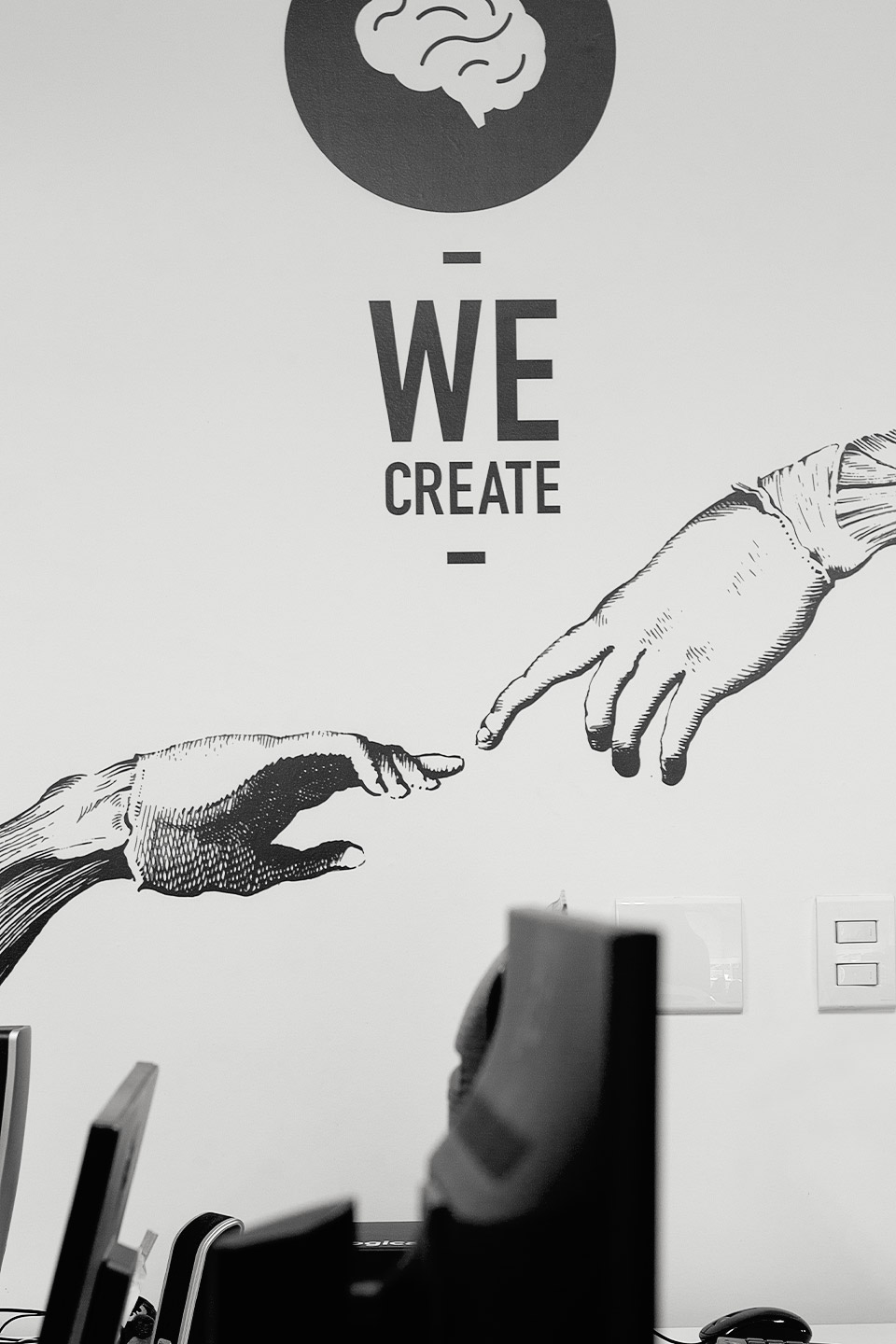
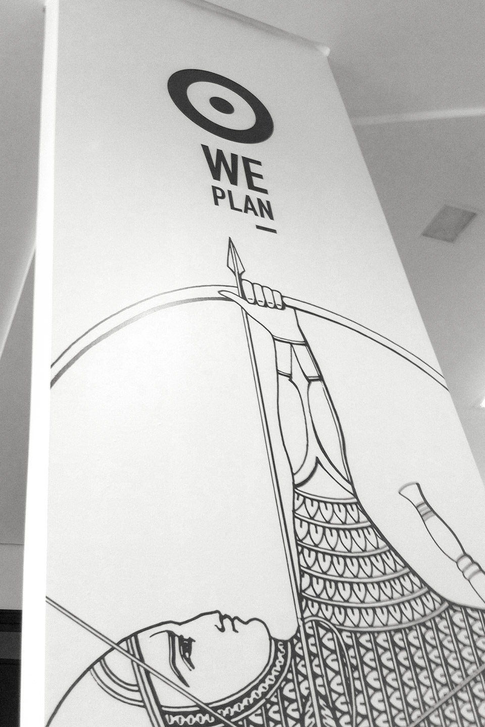
Projeto de identidade para sede da agência BRA Pós-Digital, onde cada setor de atuação foi sinalizado através da intervenção de ilustrações, tipografia e seus respectivos ícones.
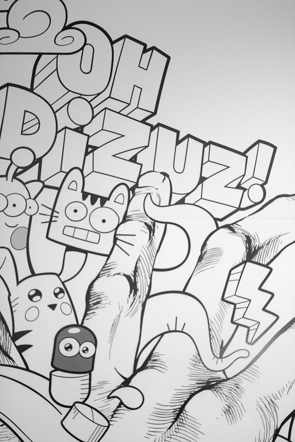
O objetivo do projeto foi caracterizar cada setor do processo da agência de maneira a buscar uma identidade visual coesa entre os murais. Para isso, se fez uso de ilustrações do tipo enciclopédicas em técnica de crosshatch, afim de contrastar ao máximo com a arquitetura moderna da sede.
Esse contraste, essa aposta na estranheza entre escolas de direção de arte é reforçada com o uso de uma tipografia moderna e condensada, cores chapadas e pontuais, e ícones tão típicos do ambiente digital.
Para isso, contamos com a vasta experiência e qualidade do ilustrador Tambeiro, orientado a buscar em cada cena o traço em crosshatch desejado. Esse recurso de contraste de direção de arte, entre o erudito e o digital representava o momento da agência: capaz de entregar tanto peças de publicidade tradicional quanto projetos em mídia digital.
Design, sinalização, wayfinding, intervenções, muralismo, ilustrações, edição de video
Identity project for the BRA Post-Digital agency office, where each sector workplace was represented through the
intervention of illustrations, typography and their respective icons.
The project's objective was to characterize each sector of the agency's process in order to seek a cohesive visual identity among the murals. To this end, we used crosshatch technique by encyclopedic illustrations, in order to contrast as much as possible with the modern architecture of the building.
This contrast, this bet on the strangeness between different schools of art direction is reinforced with a modern and condensed typography, flat and punctual colors, and icons that are so typical of the digital environment.
To do it so, we count on the vast experience and quality of the illustrator Tambeiro, oriented to seek in each scene the desired crosshatch trace.
This feature of contrasting art direction, between the erudite and the digital, represented the very moment of the agency at the time: capable of delivering both pieces of traditional advertising and projects in digital media.
Design, wayfinding, interventions, muralism, illustrations, video editing


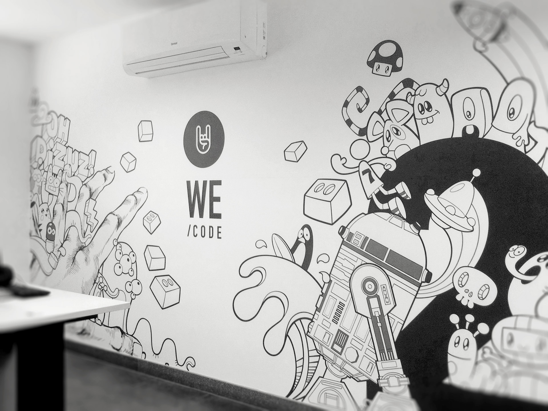
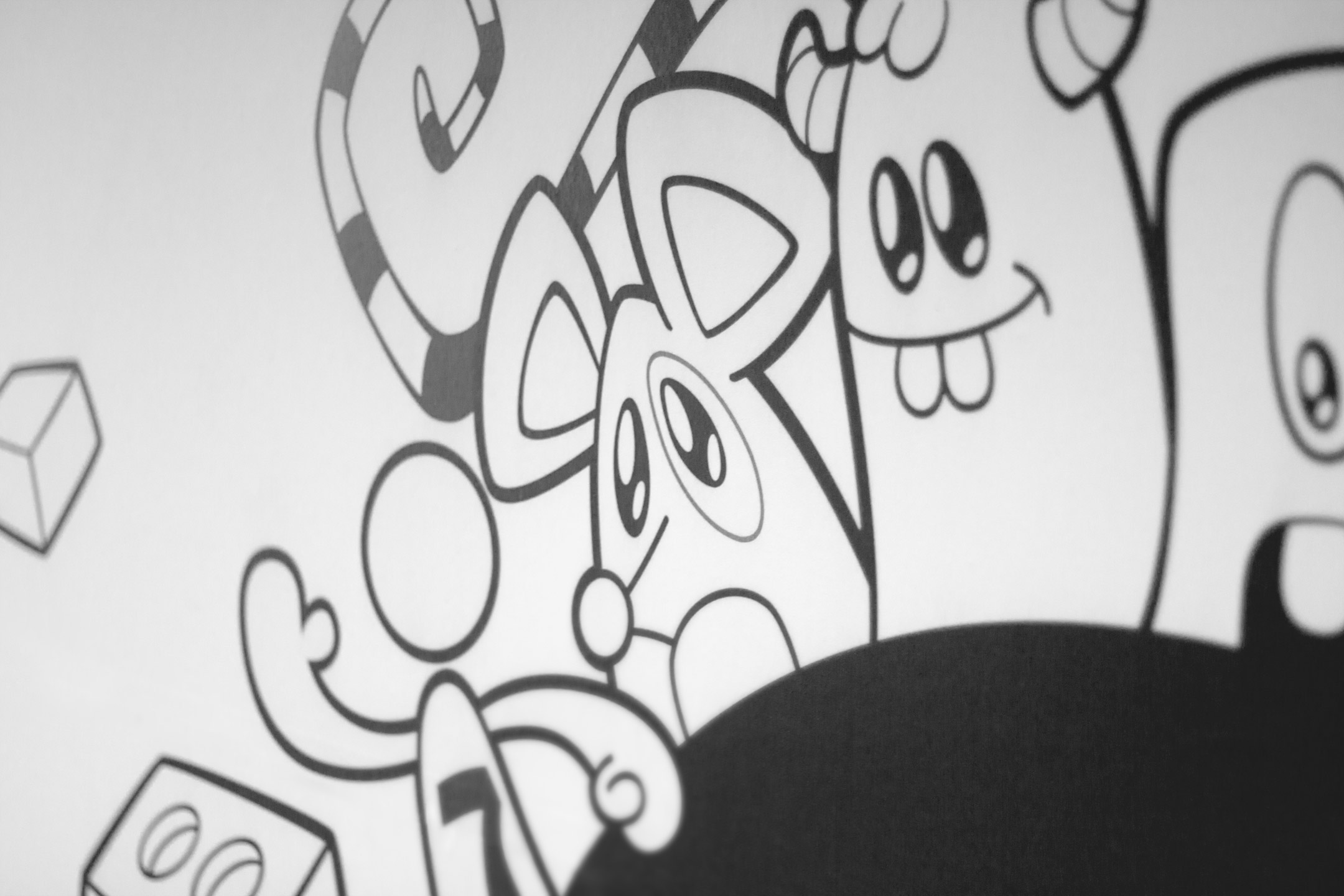
Neste mural
toda a equipe foi convidada a realizar ilustrações de motivos que lhes eram significativos de alguma forma ou de outra, e todas
estas ilustrações foram unificadas em um único traço pela técnica de doodle
drawing, como uma maneira de tornar presente e homenagear cada membro da equipe
no projeto.
For this wall, the entire team was invited to
illustrate freely motifs that were meaningful to them in some way or another,
and all these illustrations were unified in a single stroke by the technique of
doodle drawing, as a way to make present and honor each team member in the
project.


CRÉDITOS